艺术家重新创造流行的标志
Have you realized that you’re able to instantly identify a business by looking at its logo, even if its name isn’t a part of the logo? Perhaps you’ve noticed that you can correctly guess the nature of a business by looking at its logo for the first time, even if you’ve never heard of the business before? Logos can be an efficient way of communicating information clearly without using words.
你是否意识到,你可以通过看一个企业的标志来立即识别它,即使它的名字并不是标志的一部分?也许你已经注意到,即使你从来没有听说过一家公司,你也可以通过第一次看它的标志来正确猜测它的本质?标志可以是一种不使用文字就能清晰地传达信息的有效方式。
Many mascots have been around for decades. As new brands forge their way into our homes, some brands are taking time to re-develop their logos completely.
许多吉祥物已经存在了几十年。随着新品牌进入我们的家庭,一些品牌正在花时间彻底重新开发他们的标志。
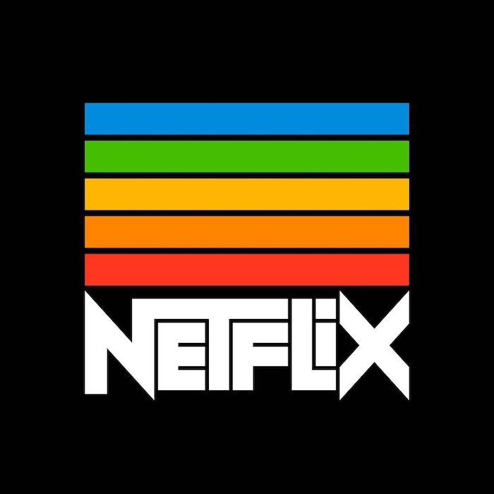
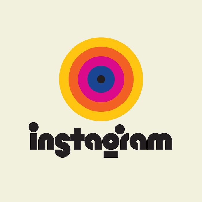
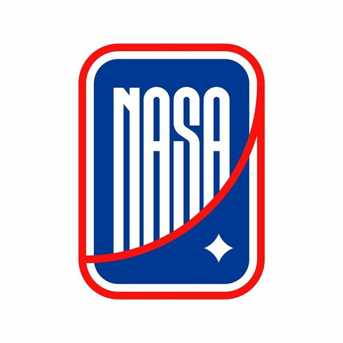
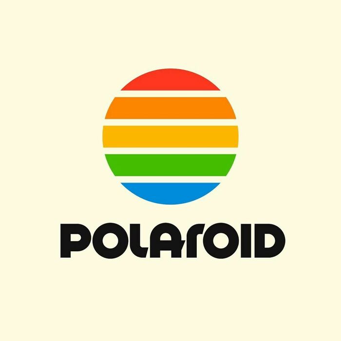
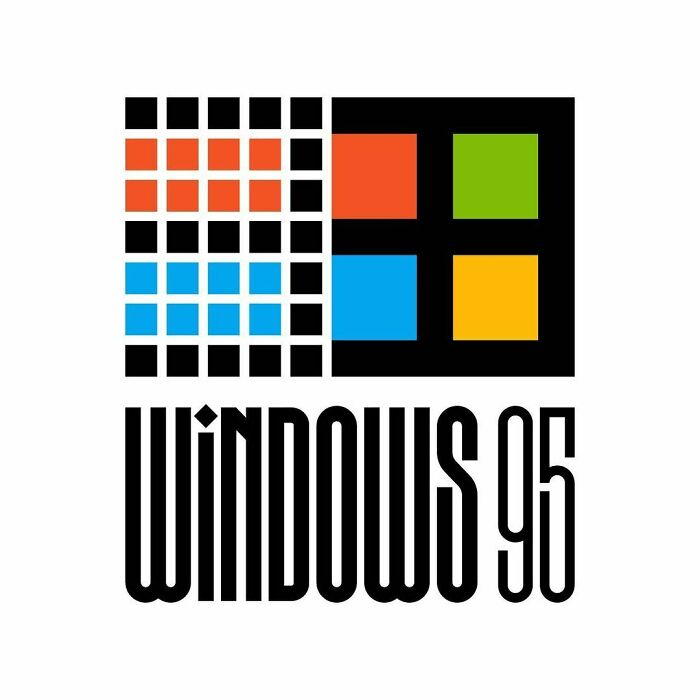
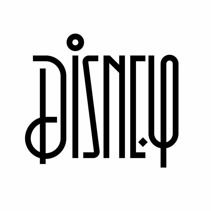
Type designer and lettering artist Rafael Serra decided to go out of his way and re-design some of the most well-known brand logos out there, giving us a completely new perspective. The artist’s work can be easily described as being old-school, and we can say for sure that we are definitely seeing that in some of his redesigns even if some of them have a twist that involves a touch of his own style.
类型设计师和刻字艺术家拉斐尔塞拉决定走出他的思维,重新设计一些最知名的品牌标识,给我们一个完全新的视角。这位艺术家的作品很容易被描述为老派的,而且我们可以肯定地说,我们可以在他的一些重新设计中看到这一点,即使有些设计涉及到他自己的风格。
#1
#2
#3
#4
#5
#6
#7
#8
#9
#10
图片来源:faelpt
More info: behance.net | Instagram


